Further development on the pattern
March 6, 2014 § Leave a comment
I have now started to try and move this low poly look onto the new bottle. As the first pattern is for a representation of the philosophers stone for rejuvenation. the new bottle of Purdey’s is for a Natural Energy bottle. I have been thinking about how all natural energy comes from the sun. So i have deiced to try and make the pattern t look like sun rays rather than the texture of a rock.
Below are some the sketching process for this.


I was having some difficulty with this one, for the rock texture the shapes didn’t have to come from one source. With some of the early on sketches all the shapes where too small.

Purdeys packaging
March 6, 2014 § Leave a comment
Blue Marlin
Blue Marlin where the company to orignally rebrand Purdeys in 2011
below is what they say about the branind in thier portfollio.
Launched in 1992 as the UK’s first rejuvenation drink, Purdey’s was way ahead of its time. But following a boom in health and wellness products of over last decade, the category pioneer was struggling against new competition.
The refreshing redesign communicates Purdey’s unique product benefits through engaging illustrations that encourage consumers to cross-reference back and front of pack information. Stylish and contemporary, the new packaging asserts Purdey’s authority as the original elixir for modern life.


Alchemi
March 6, 2014 § Leave a comment
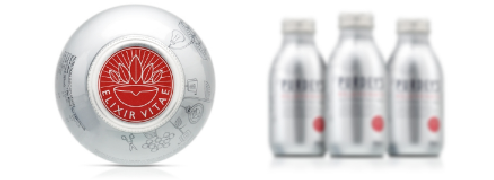
While exploring the current packaging of Purdey’s, there are a few elements that come across that give the brand a few unique features. One of them being there red seal on top of the bottle and on the side.


The term ‘Elixir Viae’ is also know as The elixir of life, also known as elixir of immortality and sometimes equated with the philosopher’s stone, is a mythical potion that, when drunk from a certain cup at a certain time, supposedly grants the drinker eternal life and/or eternal youth. The elixir of life was also said to be able to create life.
I have played on this idea, and i want to try and create the bottle in to a form of the philosophers stone.
I have started to look into visual representations of the philosophers stone.
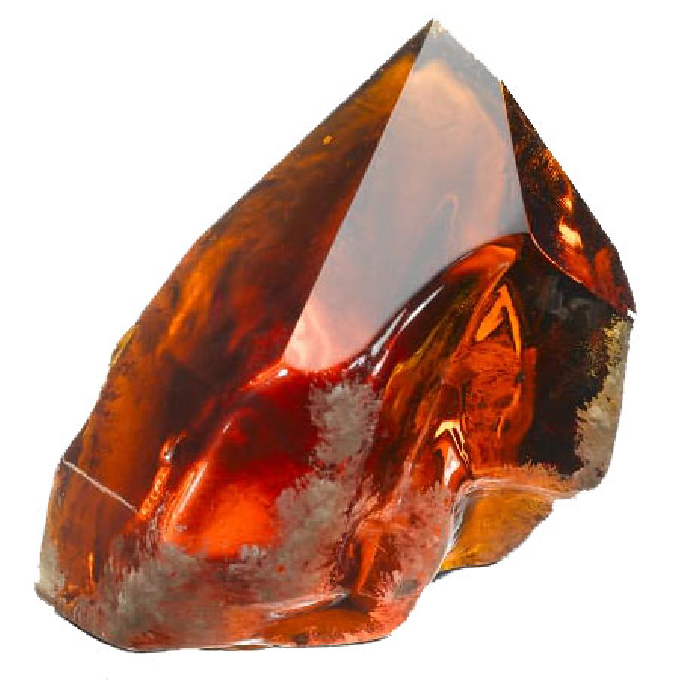
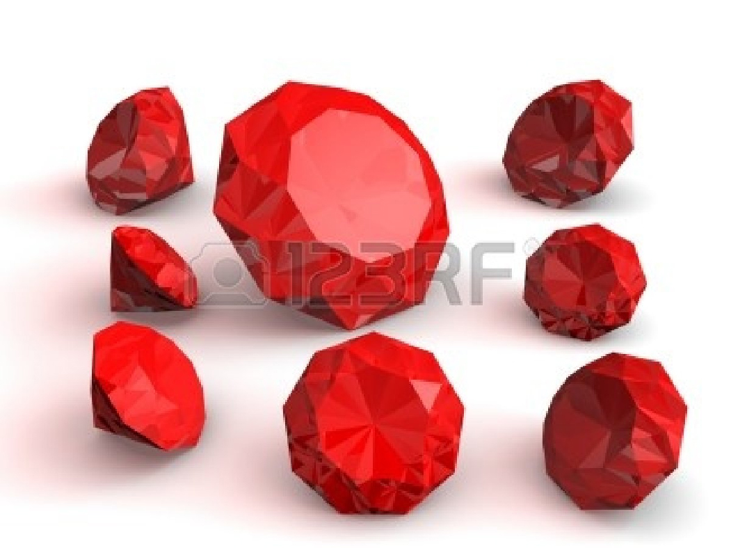

I especially liked the middle one with rugged looked, i feel like this one would work best on a a bottle some how.
I have started to look into low poly art to see how it might work on packaging.

Previous Purdey’s Promotion 3
March 5, 2014 § Leave a comment
Agency: Trend Worx
Country: Germany
Released: February 2001


The proccess of making the box
March 5, 2014 § Leave a comment
THe design element of the box is currently at the printers, and will be available tomorrow. But there where elements of the box that didn’t need to printed on, so i have made them now, in preparation for the net to come back tomorrow.
Here are some process pictures of the box being made:


Developing the Packaging further
March 5, 2014 § Leave a comment
With my packaging finally ready for print. And mock ups being made up. I can feel this project starting to come to an end, and well considering the deadline is in two days -that is probably a good thing. One if the main things i am taking from this project is that i need to work on my time management skills more. I feel like that i am probably rushing some work to try and prioritizing other work, but other all – all my work suffers because of the poor management.
Below is my net for the Jim Beam packaging.

Previous Purdey’s Promotions part 2
February 25, 2014 § Leave a comment
Agency: Saatchi & Saatchi
Country: Australia
Released: August 2000
Geezer

Curry Head

Lamp

